Asset Details
Our users needed a way to view high level information regarding their equipment at a glance. I was tasked with designing an experience that allows users the ability to find the information they need in order to make decisions, however still making the information visually pleasing.
The Details
My Role
UX Designer
Tools
Figma
Azure
Excel
Asset Details Overview
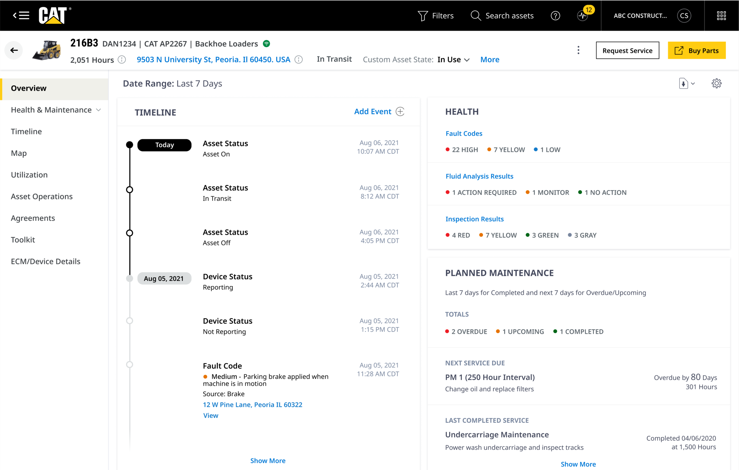
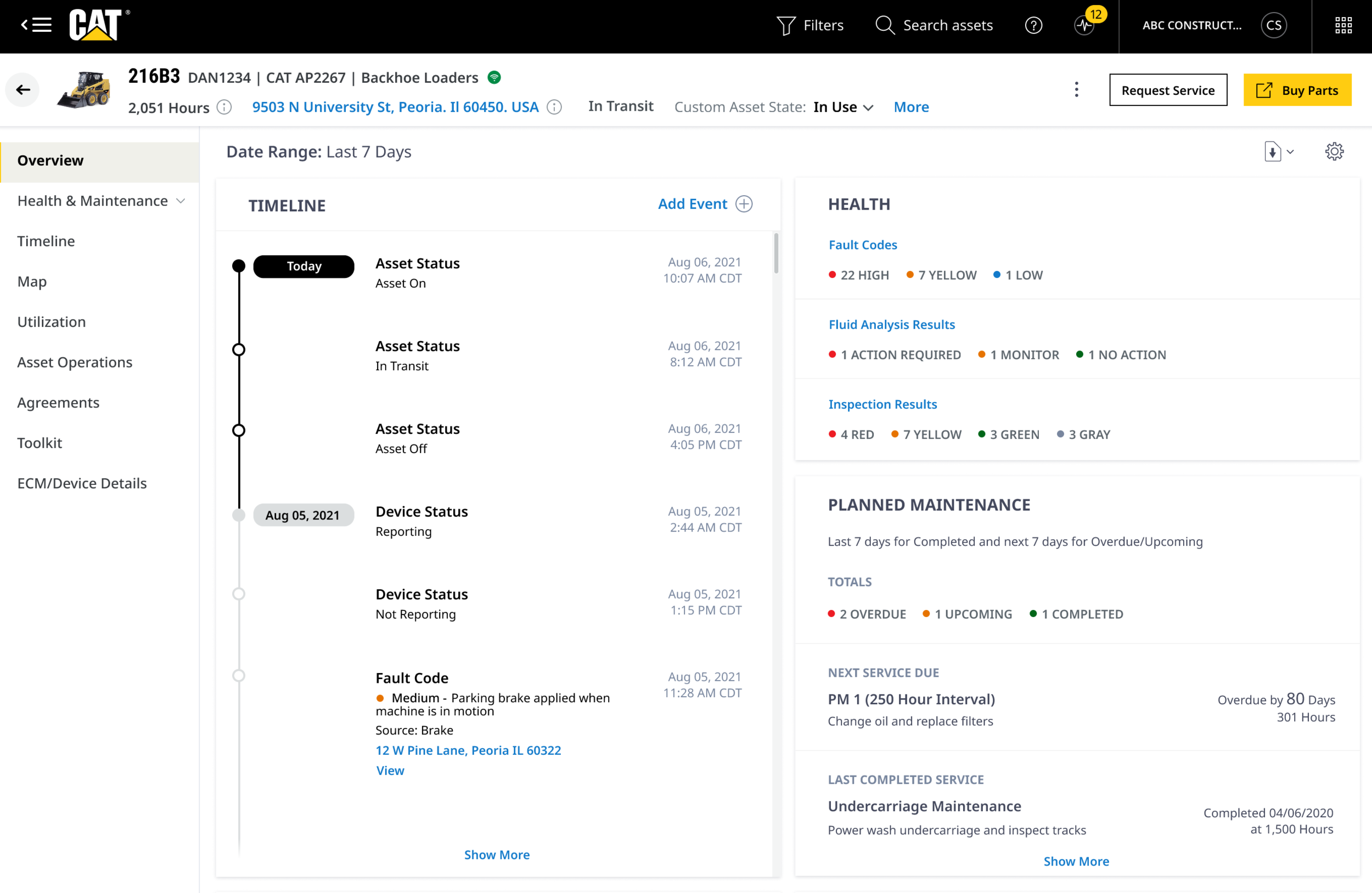
The purpose of the Asset Details Overview Page is to provide the user with a high level view of the current state of an asset with insights into the health, utilization, and location of an asset. The “Overview” page is also a place where customers and dealers can find reference data (ownership, Product Link device type, make, model, year) of an asset.
The Problem
The Fleet 3.0 team needs to provide a clean and simple view of an asset's reference data. They also need to present high level "card" views showing summaries of utilization, health, maintenance, and asset current state information to the user over the last seven days. How might we give users a quick view to discover if there are any immediate issues with a machine and the ability to dive deeper into data if necessary.
Asset Details Today
A Bare Experience
As I dug deep into the existing Asset Details page, the first thing I noticed was a bare experience. It’s also important to note that this was not contingent on the fact that one asset had more data than another, but strictly having to do with the layout and design. Nothing about it was inviting, or felt like the intent was for a user to stay and browse around which is the exact opposite of what we want our users to do.
Findability
Another issue I found with the current Asset Details page was that information was difficult to find. Findability is key with our platforms because of the amount of data and information we as a company have to share with our customers. We want to present the data that’s needed in a way that gets users the information they need in order for them to use it and take their next action.
The Solution
I used our design system that encompasses bold colors and standout components to create a dynamic layout that would ease the browsing experience for users. Due to the amount of information that would be going on the page, I was cautious around how much information I presented for each card. I kept in mind that this is an overview page and users would have the ability to drill down to a deeper level page to get more information.
Finding the balance was a challenge at times, but going back to the idea of presenting “need to know” information kept me on track. I frequently went back to the existing Asset Details page and continued to take inventory of what wasn’t working from a design perspective. Nailing aspects of the design like headings, font weights, and color usage was crucial in visually separating content in each card. These small visual aids allow users to more quickly scan the page to find what they’re looking for, and are going to be key for our busy and on the go users.
A Drill Down Experience
Due to the cards themselves not being clickable, we needed another way aside from the page tabs for users to drill down to view more contextual information. The reason for this was since the tabs are not sticky, if a user wanted to drill down, they’d have to scroll back up to the top of the page to find the tabs.
The solution for this was adding “Show More” links on cards to kick off that drill down experience. The clear text indicates to users there is more information to be seen, and the blue color is consistent with other platforms and signifies a clickable link. An example of that is shown here with the Timeline and Planned Maintenance cards.
Asset Information
The previous VisionLink experience forced users to click a small icon several times to view all asset reference data. Not only was this too many clicks for a user, but it’s not an efficient way to present data. When users are looking for reference data, they typically want to see it presented together in one singular view.
Asset Information Update
I wanted to display the asset information clearly for users as soon as they landed on the page. The information provided at a glance is what we call the primary information the user needs to know for which asset they’re currently viewing. From here, with one click the user is able to view all asset data in a modal providing a clean interaction from asset reference data to modal.
The Timeline Overview
A new concept of an event timeline was to be included in this page. Allowing customers to see the most recent (seven days) events as they come into the system will provide an easy view of the current activity of a machine.
The Problem
How might we provide broader cross-sectional, chronological asset event data that allows our customers to see trends and understand an asset’s overall state by pulling together information that is scattered throughout the application in one place.
The Solution
What I was aiming for with the timeline was the ease of use. I wanted users to be able to quickly and easily scan the timeline and it’s events and be able to have the information they needed to move forward. The timeline design went through a couple iterations. The first was a more “relaxed” look and feel that presented users with all of the necessary data we’d provide. I used brand colors like the CAT yellow to indicate the most recent events on the timeline and used our maintenance colors to indicate urgency.
The Final Iteration
The final iteration of the design came after I received a new requirement that users would have the ability to view the timeline on its own page for a better viewing and searching experience. Although all of the data would stay the same, I adopted a look that made the current date standout much more than the previous version to draw the users attention to the most recent events. With that, I also shortened the timeline card on the overview page to make room for a new feature that would have it’s own card. With the timeline having its own page, the card on the overview didn’t need to take up that amount of real estate.
Timeline Drill Down
The design of the drawer itself also took on a new look and that was another reason for the UI change. In this version, I swapped information around to ease the scannability for users and moved the date to one side of the card. This would make it easier for users to correspond dates with events in the full page version when the user would have the option to go back to view events up to two years prior.
Adding New Components
Due to the amount of scrolling a user will do on this page, I added a “Back To Top” feature that would appear one the user had scrolled or navigated so far down the timeline. This would allow users easy access to return to the most recent event. This also was a new component introduced into our design system for future needs. When new components are built, it’s an opportunity to share them with the rest of the design team for knowledge around usage and its availability. This also ensures that a duplicate component isn’t created.
The Full Size Drawer Overview
Drawer components were introduced to our design system recently after we had the need to show information and or have users take various actions contextual to the page without leaving a page. The issue with our design system was that our drawers were smaller and used for smaller actions and smaller bits of information. We quickly saw a need in several different instances for a full size drawer that would overlay the entirety of the page.
The Problem
Users needed a way to view information that’s contextual to the page they’re currently on. The flow from the page a user is currently viewing and the new information they’re trying to access should be smooth and efficient.
The Solution
The solution for the Asset Details page specifically was a full size drawer that allows a user to remain in their current experience while navigating to a deeper level. The metadata is sticky at the top for easy reference as well as in page tabs to drill down to deeper levels. When navigating to other Asset Details pages, metadata at the top remains and the page body content would change based on the page.
Test Drive Yourself
Click here to view the high fidelity prototype.
Looking Back
Based on the early feedback we’d gotten in user testing sessions, the new Asset Details page has been a big upgrade from the current VisionLink design and users are anxious to use it with their own data. At every iteration of this page I learned something new about our users needs, the needs of the business, and found new ways to incorporate my learnings. In the future I see this page growing based on the feedback we receive after the platform is launched. I anticipate new cards being added to address new user needs and possibly changes in the data that we currently show.


